
FSC's New Logo
About our New Logo
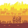
For many years, Food Secure Canada has used a beautiful work of art as its logo. The image, fondly familiar to our members, was designed by Cathleen Kneen in 2006. Cathleen served as Food Secure Canada’s volunteer chair from 2006-2011. This logo represented the many layers of our food system: from the fish in the foreground to the urban landscape in the back, along with plants, animals and wildlife, in hues of yellow, orange and burgundy. Unfortunately, this level of detail made this logo too complex to have an impact on a small scale.
 In 2012, Food Secure Canada decided to refresh its website, and along with it, develop a simpler, dramatic new logo to express the three aspects of our mandate: zero hunger, healthy and safe food and sustainable food systems. We wanted to use colours that would work well on the web, as so much of our work is internet-based. And we wanted something that our members would readily identify as Food Secure Canada, with an image and colours that would differentiate it from our many partners. A tall order.
Over 2013, Food Secure Canada worked with graphic designer Andrea Gonzales, founder of Zang c’est Andrea Communications to develop our new logo. We simultaneously worked to develop a more popular French name, as we learned that “Sécurité alimentaire Canada” made us sound more like a federal food inspection agency than a network for individuals and organizations concerned about food issues! We finally settled on “Réseau pour une alimentation durable” (RAD) after a contest generously sponsored by the Montreal restaurant le Bleu raisin.
The three colours can be interpreted in different ways: as plants, water and earth (all of which are required for food), or, alternatively, as health, justice and sustainability (all of which are required for the kind of food system we wish to build). The berry, or apple depending on your point of view, is a quintessential Canadian food, rich in symbolism and history. At a very basic level it represents to many Canadians a healthy, locally produced food that should be accessible to all.
We are thrilled with our new logo and hope that you like it as much as we do.